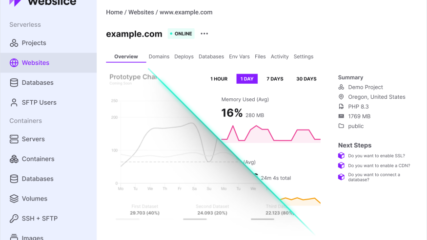
We've rebuilt how metrics are displayed in the Webslice Console. If you've been checking your websites, databases, servers, or containers recently, you'll have noticed the change — clean metric cards where there used to be busy charts.
Here's what we changed and why.
Too much information, not enough clarity
The old metrics charts had been bothering us for a while. They worked, in a technical sense, but they never quite fit.
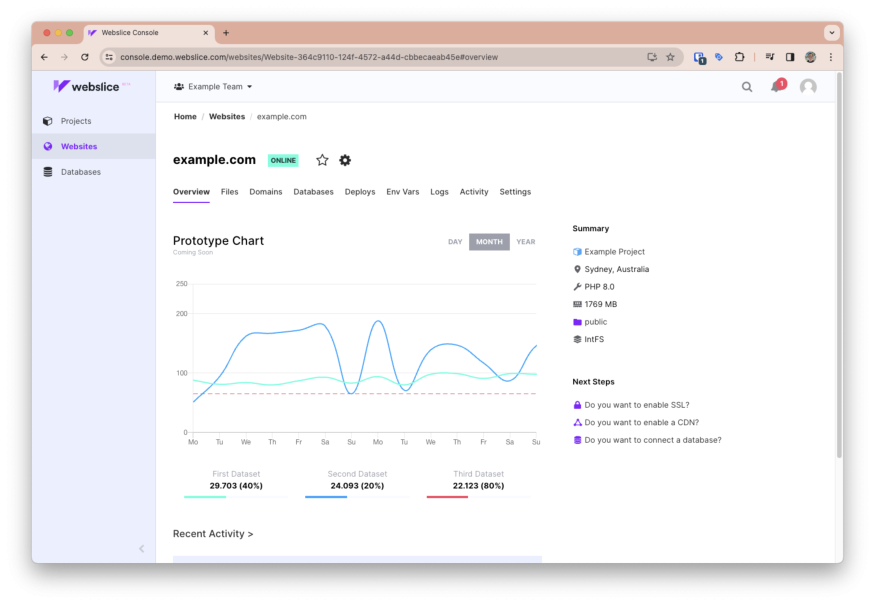
We were using chart.js, which is a capable library that powers visualisations across the web. The problem was that "capable" entailed "complicated". When the idea is for you to get useful data with a quick glance, too much information is an issue. Overlapping lines of different colors were crammed onto one chart. You had to decode legends and axes just to read the data. Toggles and presets gave you more decisions to make. Things were too busy, and required too much squinting at the screen.
More than that, it just didn't feel like the rest of the console. We've worked hard to keep Webslice clean and focused, but metrics stuck out as different, in a bad way.
Another problem: these were the only metrics you got. If you needed to take a deeper look—with custom queries, flexible date ranges, or the ability to filter and compare—you were out of luck. This is a separate problem that we have solved elsewhere. The Console wasn’t the right place, so we’ve also introduced a new Grafana integration for diving into your data. We’ll say more about this at the end of this article. For now, let’s take a closer look at the simplified metrics screen.
The Webslice Console’s new metrics screen
The new metrics view is already live, so you’ll encounter it next time you log into Webslice and:
Select a serverless website, or
Open a container’s Graphs tab.
When you do, you’ll see a set of small trend charts, each designed to do one thing well.
The exact metrics depend on whether you’re looking at Webslice Serverless or Webslice Containers, but either way the principle is the same: show what matters, nothing more.
It looks good, too. If you’re familiar with Cloudflare's analytics interface, you might notice how that smart design has inspired us.
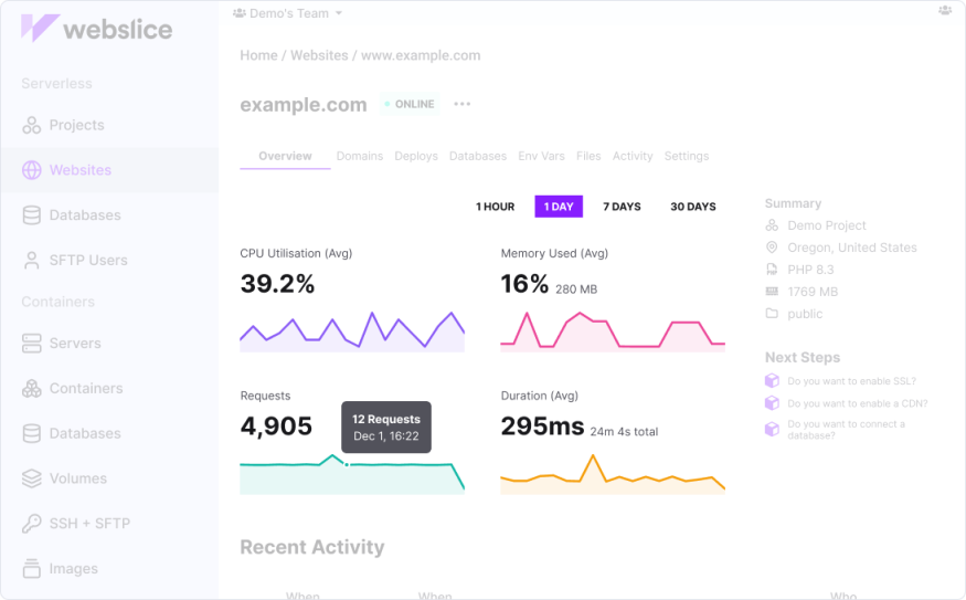
With separate cards for each important metric, you’ll now see:
A trend line showing how the metric changed over time (you can choose from four time periods).
A subtle filled area beneath the line for visual weight.
Hover tooltips with precise values and timestamps.
An overall value is shown for each metric over the selected timespan. This could be a total (e.g. total requests in a day) or an average (e.g. average CPU utilization over an hour). The result is a clean, modern visualisation that gives you the headlines without overwhelming you.
This means you can quickly scan multiple metrics without deciphering legends or overlapping lines.
Hover over any point to see the exact value and timestamp. No more guessing where that spike occurred or trying to read values off a crowded axis.
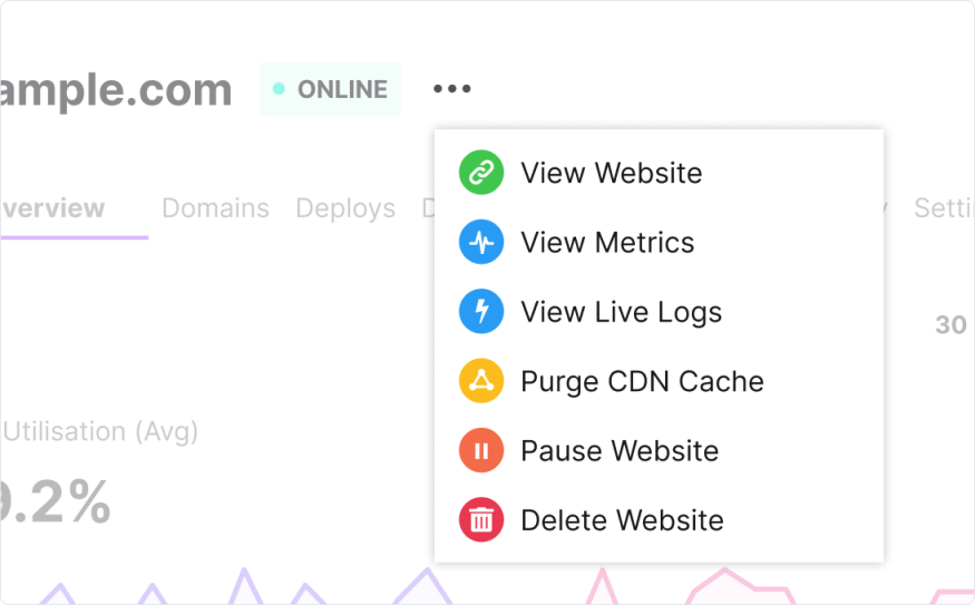
And if you need to know more, open the options near the top of your screen and select View Metrics, next to the heartbeat icon.
SVG sparklines offload technical baggage
The new Metrics screen doesn’t only solve design issues. There was technical baggage too.
The old charts required four separate npm packages (chart.js, react-chartjs-2, @coreui/react-chartjs, and chartjs-adapter-moment) totalling hundreds of kilobytes. Chart.js alone adds around 80KB gzipped to your browser download — and that's before it even starts rendering.
Because chart.js renders to a <canvas> element, the browser had to initialise the library, parse the configuration, and paint pixels to a bitmap before you'd see anything. On slower connections, there was a noticeable delay.
We've replaced all of that with something dramatically lighter: custom SVG sparklines. The technical difference matters here. SVG renders instantly. There's no charting library to bootstrap, no canvas to initialise. Our entire sparkline implementation is approximately 2KB with zero external dependencies. That's a 40× reduction from chart.js alone. Your metrics appear the moment the data arrives from our API. All the browser has to do is draw the path.
Aesthetics: Looking good on every screen
Because we're using SVG rather than canvas, the charts scale perfectly on any display. Retina? Sharp. Mobile? Readable. The lines stay crisp because vectors don't pixelate.
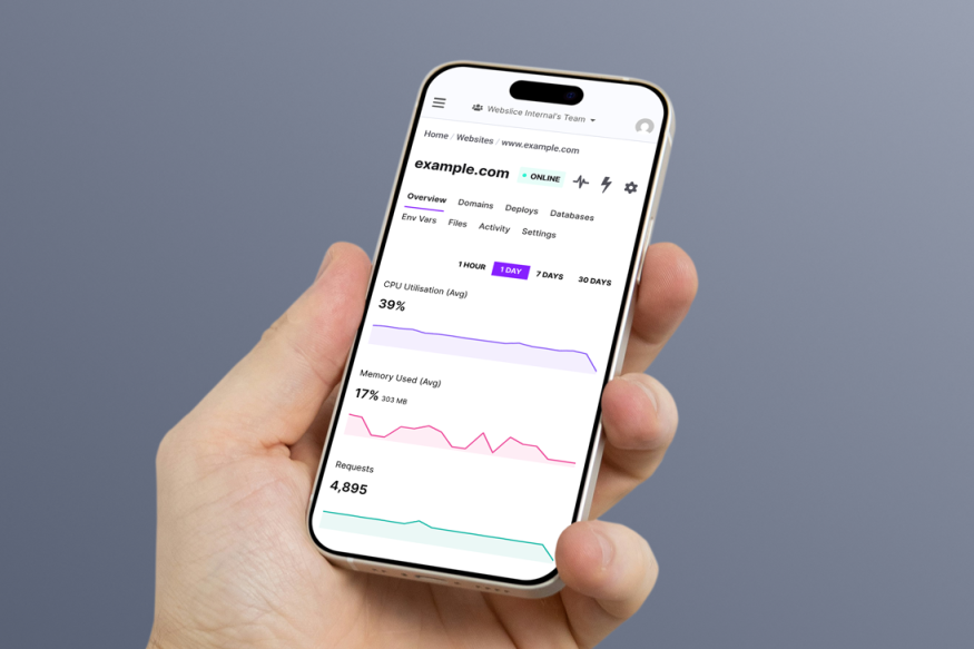
Our custom implementation does exactly what we intend, with no surprises. This is the end of chart.js behaviours that could make your eye twitch, like its auto-scaling, animation defaults, or tooltip positioning quirks.
Sparklines also maintain their visual clarity at any width, unlike chart.js lines that could appear thicker or thinner when you resized your browser window. The layout adapts too. On desktop, the metric cards tile across the screen. On mobile, they stack vertically. The sparklines stretch to fill their container without line thickness changing. There’s no awkward cropping or visual distortion.
In short, this is a real aesthetic upgrade.
Accessibility: Sounding better, too
The new metrics are more inclusive and accessible. From a screen reader’s point of view, canvas-based charts are essentially images with no useful alt text. If you used assistive technology, you got the silent treatment. We’re sorry about that, and very glad to say that SVG elements remain in the DOM and can be interpreted by screen readers.
Longer timespans and downsampling
Enough about good looks, let’s get nerdy.
For those interested in what's happening under the hood: when you're viewing longer time periods like 7 or 30 days, we can't plot every single data point without creating visual noise. Instead, we use a min-max downsampling algorithm.
This divides your data into buckets and keeps both the minimum and maximum value from each bucket. The result? Peaks and valleys are preserved. You'll still see that traffic spike from last Tuesday, even in a compressed view.
Cleaner, clearer code
Beyond what you see in the console, this change removes over 50MB of dependencies from our node_modules and deletes 1,548 lines of dead code. This is good for everyone.
Fewer dependencies means fewer security updates to track, fewer potential breaking changes when we upgrade other packages, and a smaller attack surface overall. It's the kind of work that doesn't make for exciting screenshots but makes everything easier to maintain going forward.
This is a good example of the improvements that we have the time and space to make now. After launching an entire hosting platform in each of the last two years, today we have the capacity to polish what we’ve already built. There’ll be more good stuff to unveil in the future.
Don’t forget the deeper data
We’ve said a lot about simplification and lightness here, so let us reiterate again that these new metrics are literally just the surface. Much more thorough dashboards now live in a separate, Grafana-based interface that you can get to by clicking the icon above your sparkline charts.
When you need deep analytics—custom queries, flexible date ranges, the ability to filter and compare—the Console isn’t the right place. That's why we integrated with Grafana, giving you access to proper dashboards when you need them.
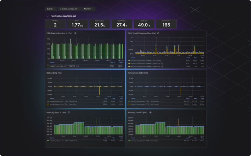
In here you’ll see deeply detailed data from any time range from minutes to years, split across dozens of charts. If you need more than a headline, this is where you’ll find the full story.
Questions or feedback?
Once you’ve taken a look at the new Webslice metrics interface, we’d love to hear your thoughts. Get in touch with your feedback or ideas and, who knows, perhaps you can influence the next round of improvements that we make to the way your hosting data gets visualized.
